How to design a unique logo
You know the drill. A new project starts. Timings are tight. You look for insights, surround yourself with research. Anxiety starts taking over. You look at the problem from different perspectives. Upside down, left and right. And then, while pouring yourself a good cup of coffee, aHa! the moment finally arrives. You’ve nailed it. Later on, while confidently presenting your idea, someone eviscerates your ego with a cruel
“It reminds me of something”.
Meaningful simplicity
For me, designing a logo, the visual representation of a given entity, has always been an endeavor through simplicity. I can’t help it. I like simple things. And I think I’m not alone. Look at the most celebrated brands in the world — simple visual metaphors. Look at all the recent trends not only in graphic or visual design but also in product design. Flat design. Simplicity. Minimalism.

A logo needs to be simple, iconic and smart.
And obviously, it must be a good fit. It should tell a story that is meaningful
to the entity it represents and all its stakeholders.
But isn’t it also supposed to be unique?
Well in a certain it is should be unique. But we need to question the feasibility of aiming for the absolutely unique, the never before seen logo. Nowadays you just can’t be sure.
Apart from the intrinsic dynamics of capitalism, entrepreneurship is the new global norm. Everyone is looking to strike it on their own, to invent their own future. Start a business. Have an online shop. Build an App. Create a brand.
The number of websites worldwide has already passed the 1 billion milestone. Over 100 million businesses are started every year. And not to mention the number of apps hitting the App store every day. And you know what? Nearly every single one has a logo.
The sheer number of existing logos sets us on a unrealistic search for uniqueness. More often than not, that great idea you have, it has been done already.
Think about the vast number of designers and agencies working on projects for similar clients around the world. We all visit the same websites, read the same books, watch the same shows, have the same education, references, influences, idols. It will be similar. It’s only natural.
Imagine asking different Bakers to make a bunch of Cupcakes. You would get a vast variety of different tastes and colors. But in the end it’s just bunch of similar looking Cupcakes.
The simpler the execution is, the more likely it is that you’ll find an endless stream of similar solutions.
Finding a balance between simplicity and uniqueness has become the most difficult to solve identity design paradox.

So, what do about it?
Bear in mind, similar logos are not always problematic. You need to take in consideration aspects such as degree of similarity, the industry both companies are operating on, whether they are competitors or not. And most importantly, could their customers become confused in the end?
That being said, I tried to summarize a group of personal processes and lessons I’ve learned that might help you create something — who knows — somewhat unique.
1. Stay true to the Brand
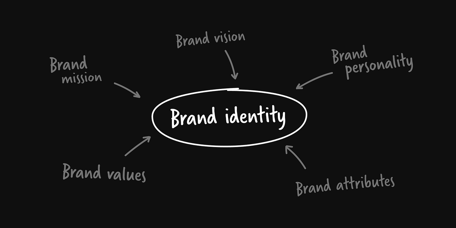
Look for the essence of the Brand. What’s the brand purpose? Target Audience? What’s the set of values that define it? The Personality? All these aspects define what a Brand is and should help differentiating it from the competitors. And the logo, as the most simple visual representation of the brand needs to reflect its strategy, its positioning, what the brand stands for.
If you’re not given this sort of information before embarking on a Brand identity project then you could define it together with your client. If you don’t know where to start, The Three-Hour Brand Sprint is a good and well documented group of brand exercises to get the ball rolling.
A brand model usually brings together all this relevant information in a diagram. It’s one of the most valuable tools in the ideation process. It will make all complicated questions & dilemmas way easier to solve. Like a guiding light on the decision-making process it will keep you on the right track and make sure your brand is translated visually in a way that is true and unique.
Is this color appropriate for our audience? Does the typography convey the right personality? Is this logo telling a story that resonates with the purpose of the brand?
2. Be aware of the competitors
It always helps me getting some perspective. When you realize that most clients and Brands are acting locally and not globally, it becomes clear that you should focus on the specific market they’re in and not the whole world. You need to consider your client’s competitors, not every company in the other side of the world. Research them meticulously. Their logos, colors used, visual metaphors. Compare them. Keep them in mind during the whole process to avoid falling into commonplaces. A Brand needs to occupy a unique place in the market.
Having a logo that is somewhat similar to the one of a direct competitor might not kill, but it definitely won’t help.
Below you find two Monograms from two famous international Design agencies. Although far from a case of plagiarism, both the aesthetic and the colors used are similar enough to make the case for a missed opportunity in differentiating their brands.

3. Use Google
Trademark screening is a business that takes time and whose costs can easily amount to thousands of euros/dollars. It is a specialized service provided by Trademark Lawyers and very often not even offered by Design agencies.
Thus, it should not be the designer’s burden to research and be aware of all logos available in the world. I’m not saying that copying something is ok. But it’s not your task to ensure that something you do was never seen before.
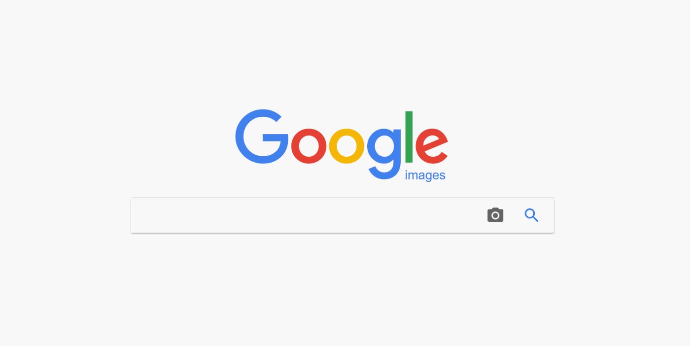
That said, I always do a rudimentary screening on my side with Google reverse image search. It is a tool that helps you finding similar images on the internet. Go to Google Images, click on the camera icon, upload an image of the logo you’ve designed and cross your fingers. It has helped me veto ideas that I thought were good only to find out they were kind of common.
I hope my strategies can help you avoid doing something that was already done in the past. But don’t let your creativity be discouraged by the fear of finding something similar.
@Credits: Medium
